overview
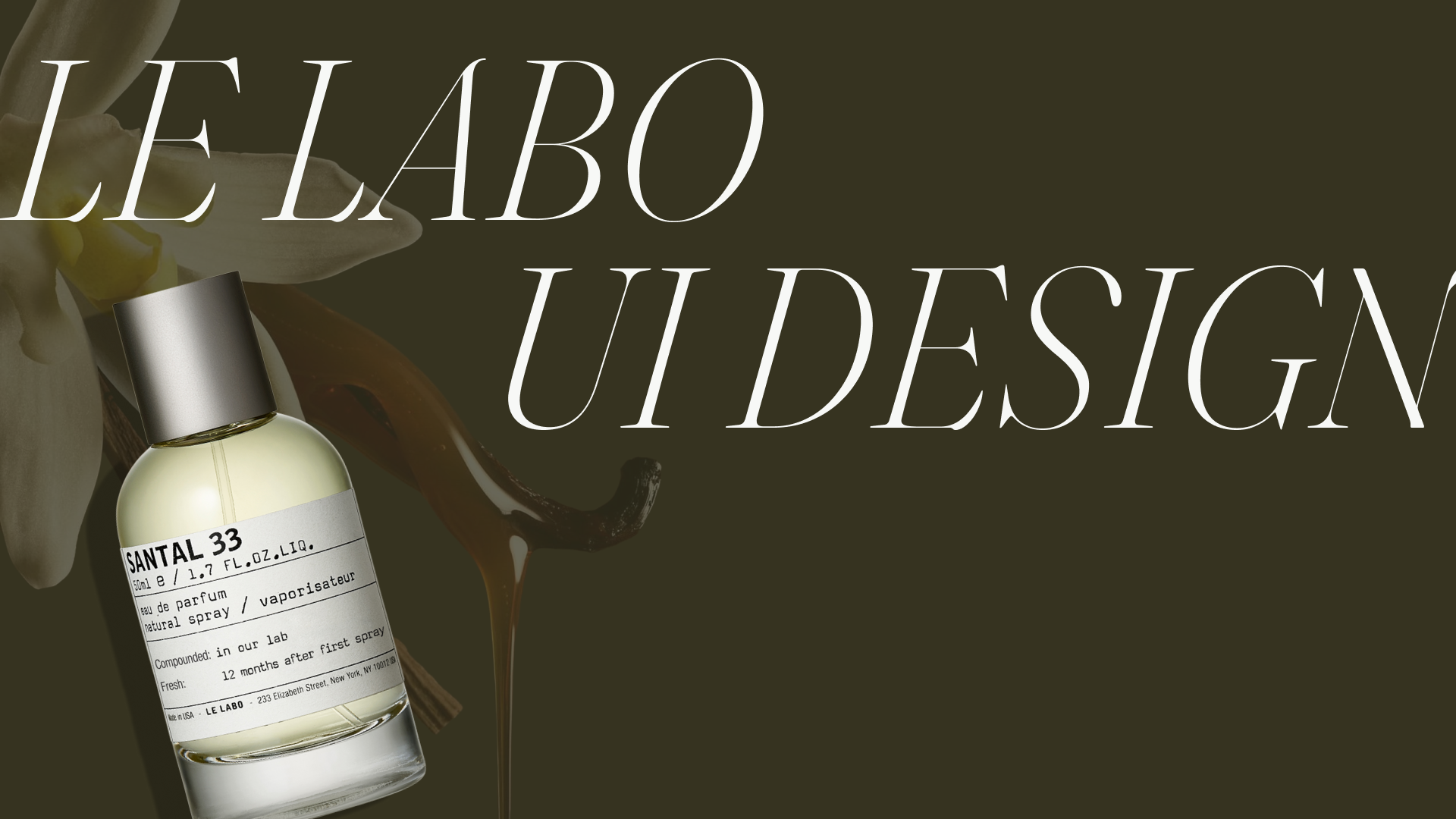
this redesign reimagines le labo's digital interface with a refined ui refresh that emphasizes clarity, experience, and efficiency. the redesign translates the brand’s handcrafted, sensorial identity into a modern digital experience, prioritizing intuitive navigation, elevated typography, and a quiet, luxurious visual system.
this redesign reimagines le labo's digital interface with a refined ui refresh that emphasizes clarity, experience, and efficiency. the redesign translates the brand’s handcrafted, sensorial identity into a modern digital experience, prioritizing intuitive navigation, elevated typography, and a quiet, luxurious visual system.
tools
adobe creative cloud, figma, miro
adobe creative cloud, figma, miro
role
ux/ui designer
ux/ui designer
timeline
15 weeks
15 weeks
team
solo project
solo project
problem
le labo’s problems:
> website lacks a clear hierarchy, engaging hero, or ctas, making navigation and product categorization confusing
> the site offers little interactivity, leading to low user engagement overall
> product detail pages (pdp) are visually unappealing, missing key product info, ctas, and a review system, weakening trust and sales
le labo’s problems:
> website lacks a clear hierarchy, engaging hero, or ctas, making navigation and product categorization confusing
> the site offers little interactivity, leading to low user engagement overall
> product detail pages (pdp) are visually unappealing, missing key product info, ctas, and a review system, weakening trust and sales
solutions
purposed design solutions:
> redesign the homepage with a stronger visual hierarchy, engaging hero, and clear ctas, plus an interactive features for audience engagement
> elevate navigation and product categorization for a smoother and sensorial browsing experience
> rebuild pdp with richer product info, more ctas, and a review system to boost engagement and conversations
purposed design solutions:
> redesign the homepage with a stronger visual hierarchy, engaging hero, and clear ctas, plus an interactive features for audience engagement
> elevate navigation and product categorization for a smoother and sensorial browsing experience
> rebuild pdp with richer product info, more ctas, and a review system to boost engagement and conversations
design and development
art direction
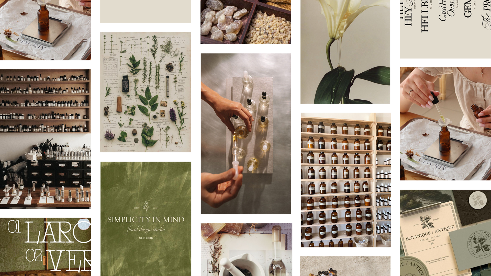
using le labo’s brand archetypes, the creator and the sage, to define their new visual look. the archetypes emphasize intention, experience, and transparency. It encourages customers to connect with the brand on a personal level.
view the moodboard and design principles that define the look and feel.
art direction
using le labo’s brand archetypes, the creator and the sage, to define their new visual look. the archetypes emphasize intention, experience, and transparency. It encourages customers to connect with the brand on a personal level.
view the moodboard and design principles that define the look and feel.
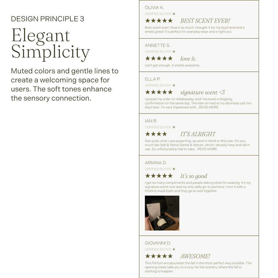
ui design
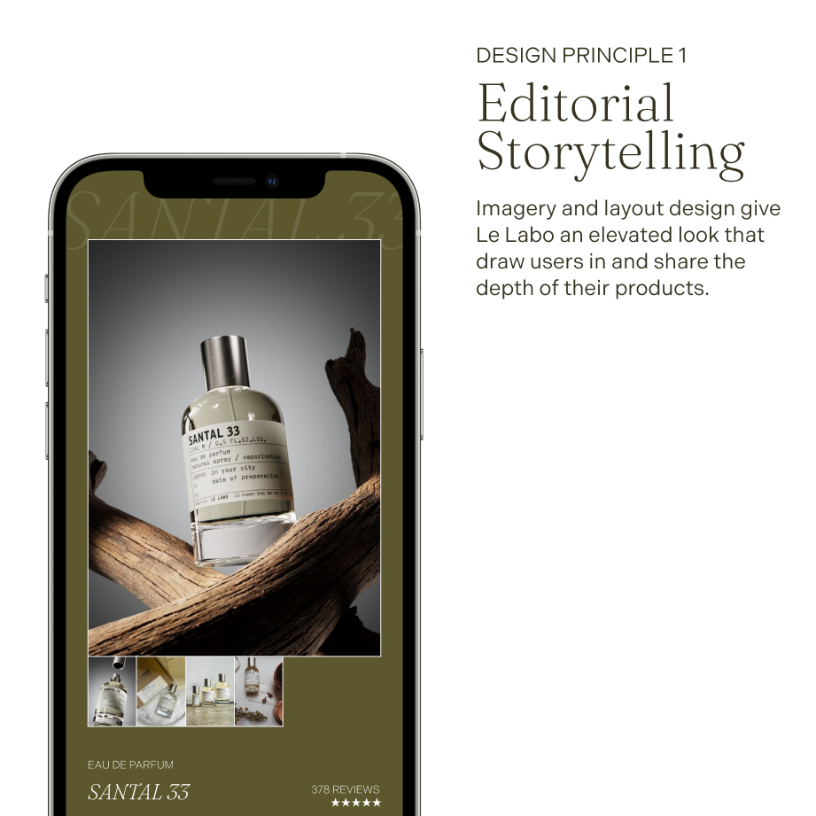
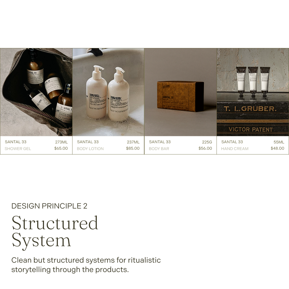
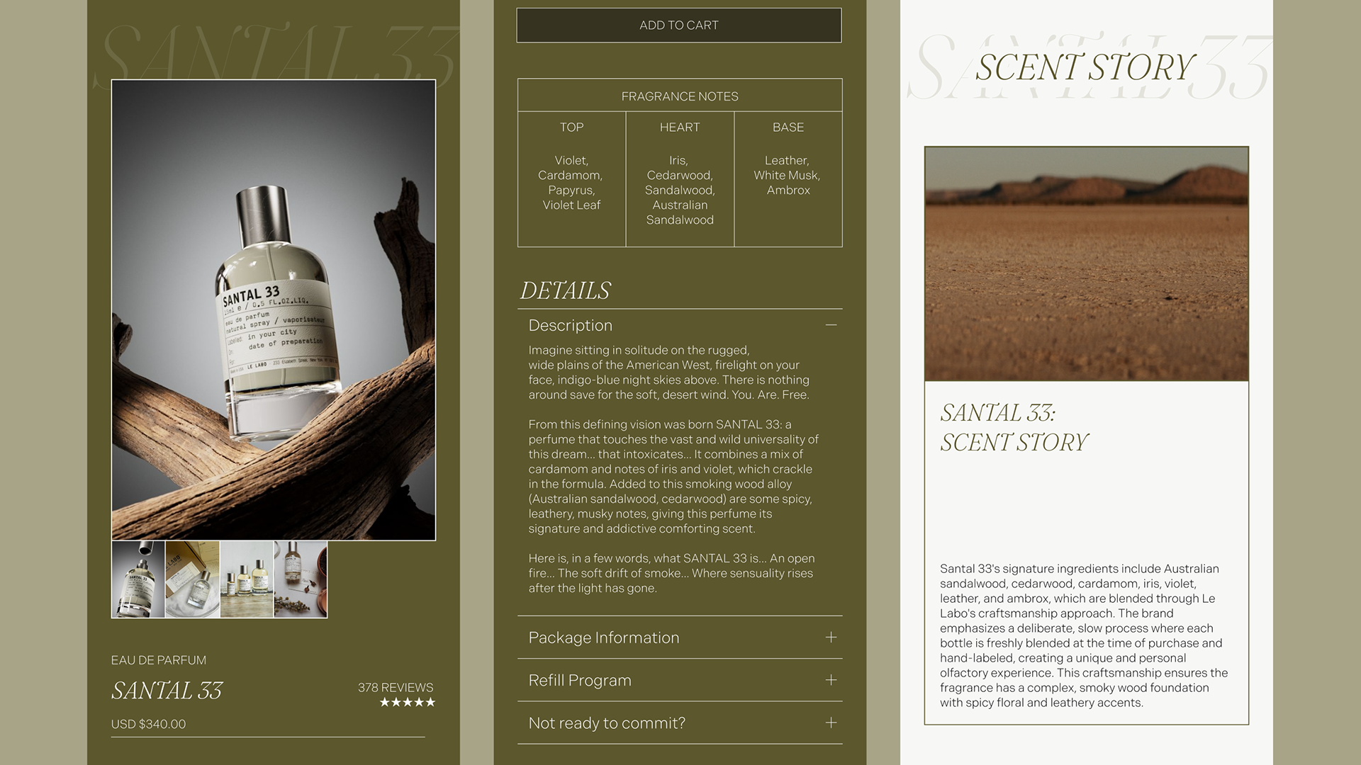
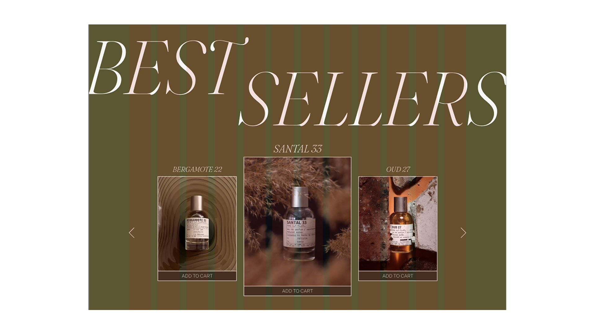
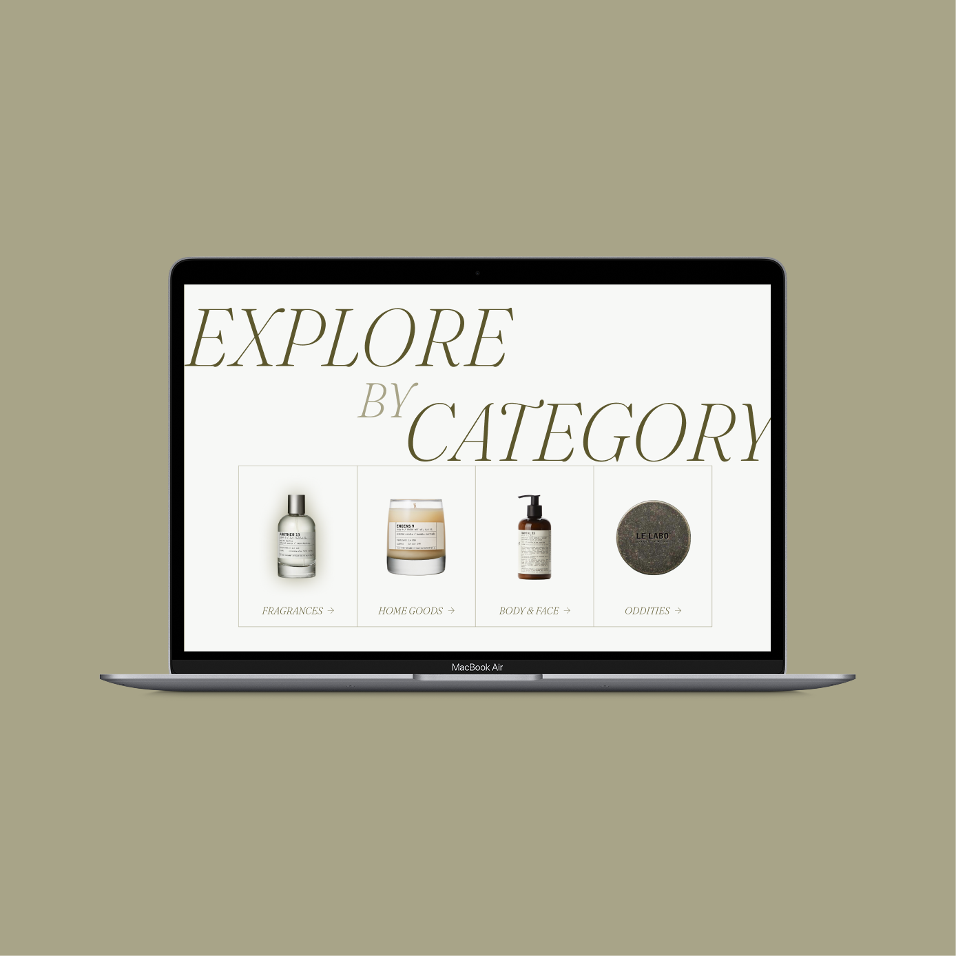
an editorial and sensory-driven redesign with a new palette to create a more conversational experience for audiences. large imagery and expandable sections make the product feel aspirational and develop an overall more elegant yet informational experience.
an editorial and sensory-driven redesign with a new palette to create a more conversational experience for audiences. large imagery and expandable sections make the product feel aspirational and develop an overall more elegant yet informational experience.
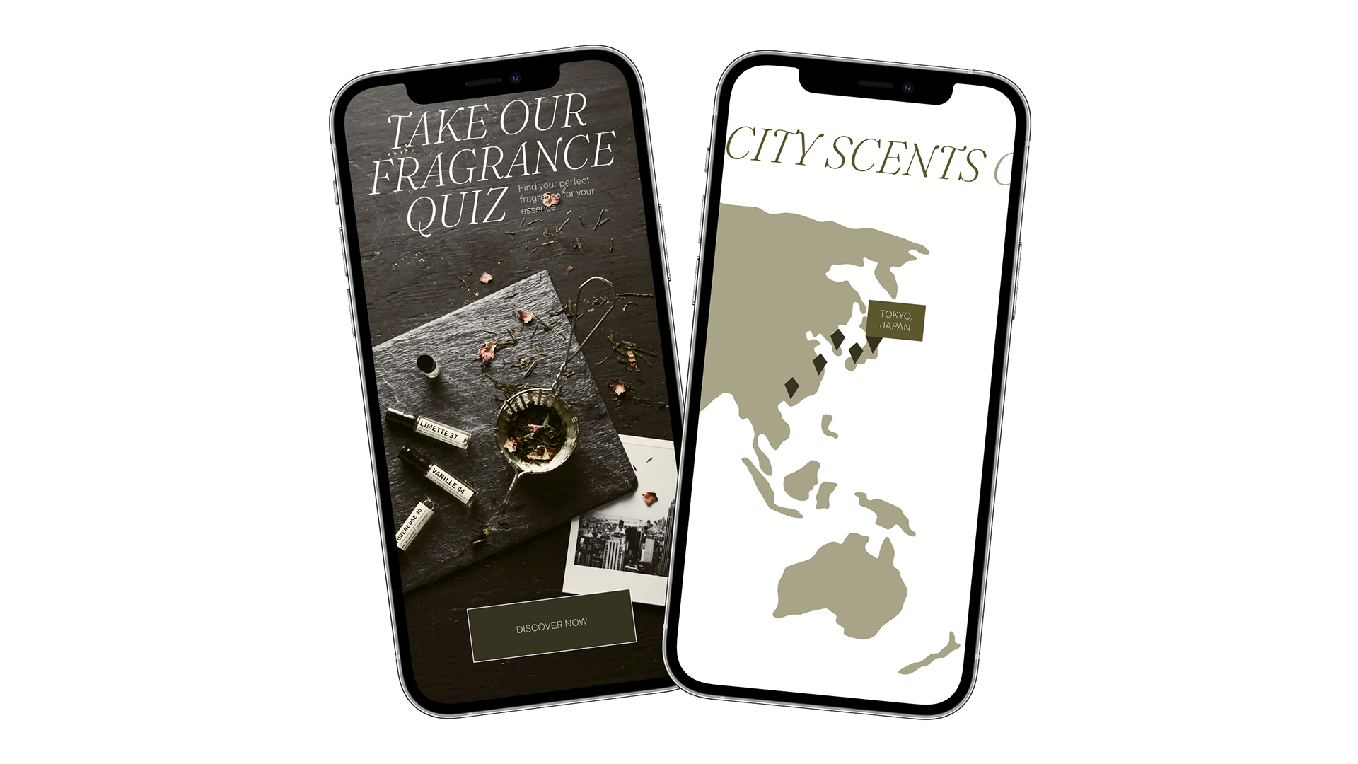
updated features
two new interactive features: a personal fragrance quiz and a fragrance map for le labo's city-inspired fragrances. users will have a more personal shopping experience and gain insight to a few of the fragrances’s histories.
two new interactive features: a personal fragrance quiz and a fragrance map for le labo's city-inspired fragrances. users will have a more personal shopping experience and gain insight to a few of the fragrances’s histories.
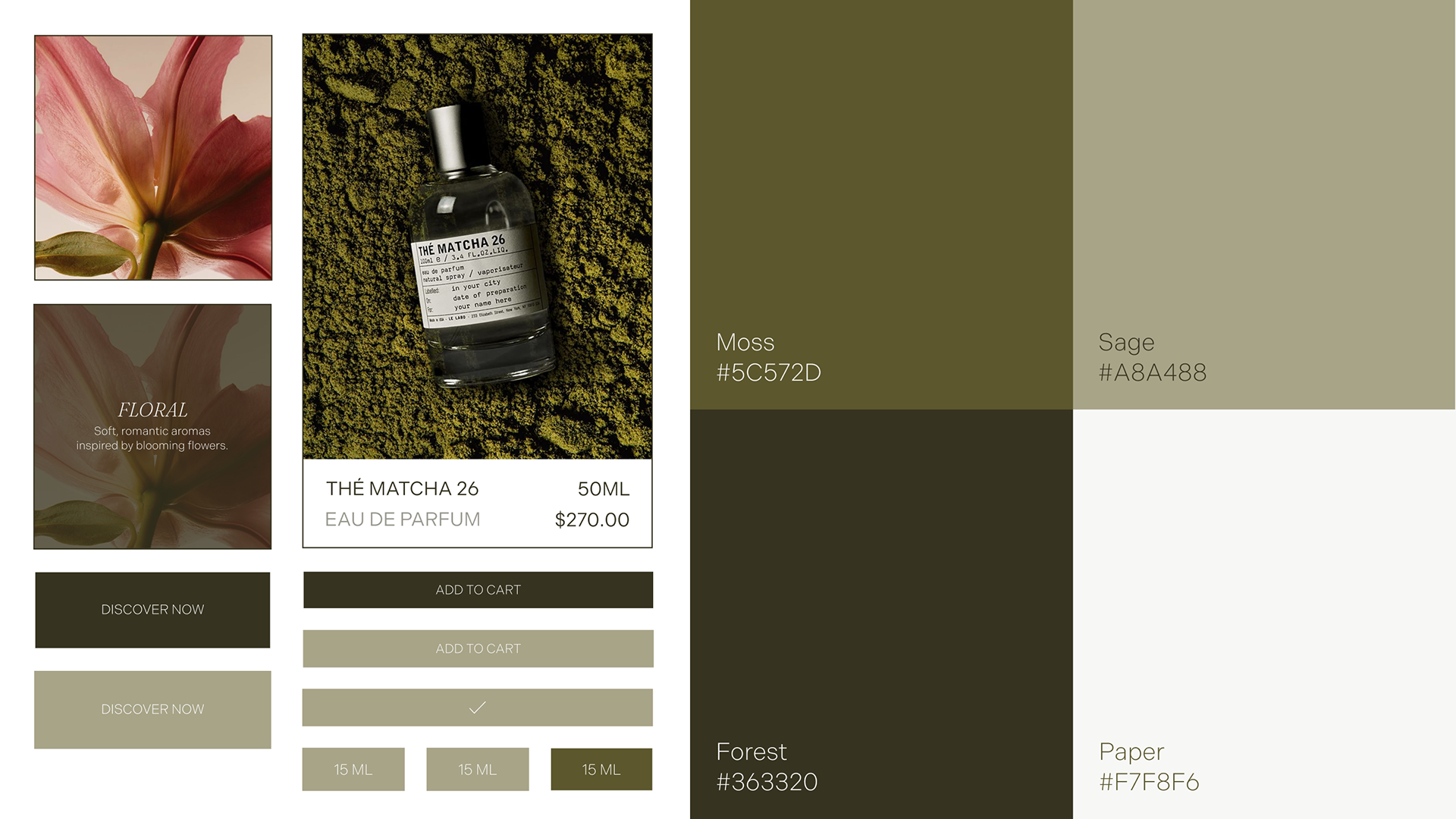
design system
muted colors, polished typography, and desaturated imagery supports the sensory, story-driven experience. the grid system and minimal ui elements support clarity and structure.
muted colors, polished typography, and desaturated imagery supports the sensory, story-driven experience. the grid system and minimal ui elements support clarity and structure.
typography
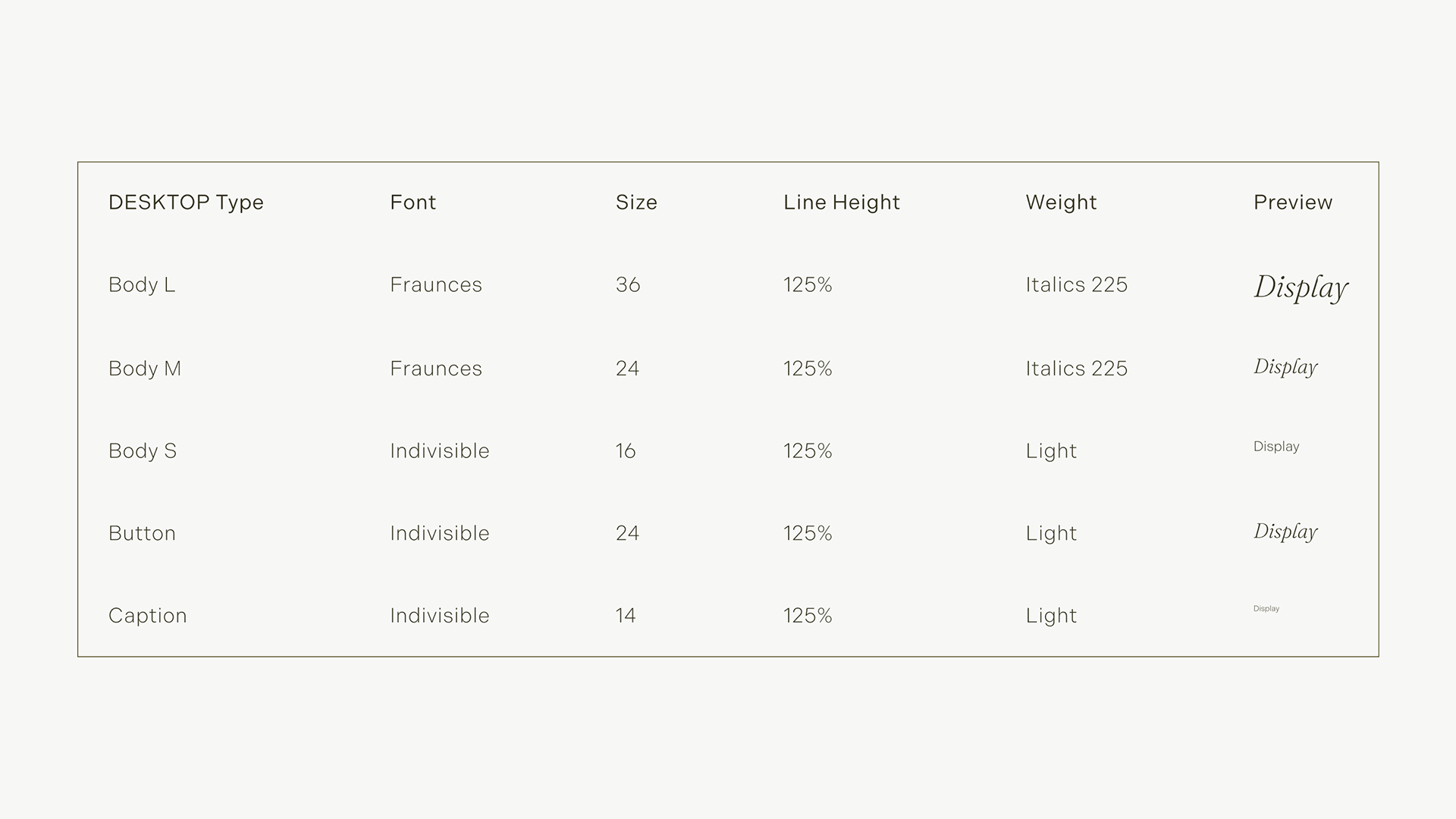
a clear pairing of a serif display font with a clean sans-serif for body copy and ui elements. the serif adds a literary, luxury feel while the sans-serif keeps things legible and functional.
a clear pairing of a serif display font with a clean sans-serif for body copy and ui elements. the serif adds a literary, luxury feel while the sans-serif keeps things legible and functional.
dark mode
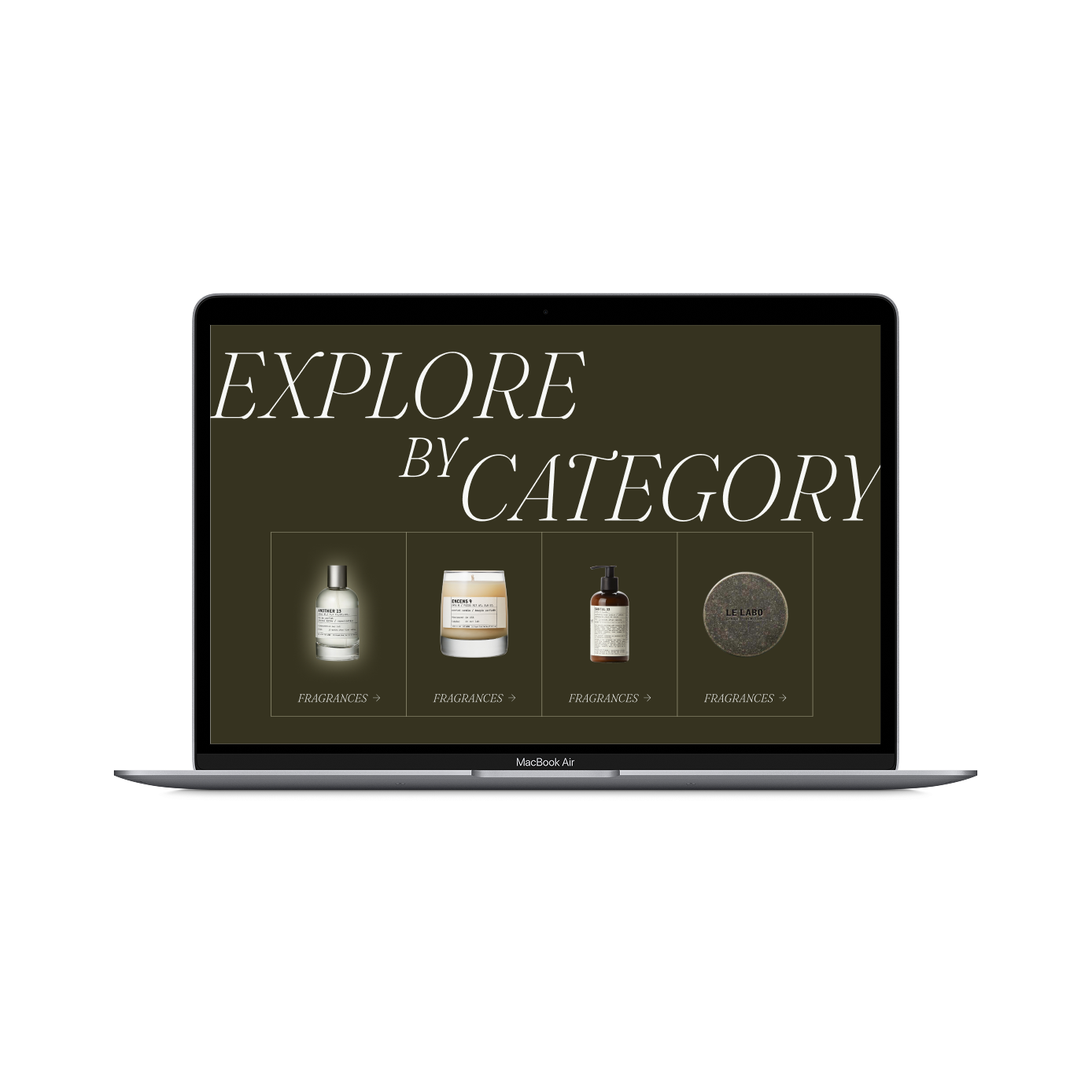
maintain the elegance and intentional feel of the original design and color palette, while meeting accessibility standards.
maintain the elegance and intentional feel of the original design and color palette, while meeting accessibility standards.
video scroll throughs
takeaways
> design should feel personal and tell a story while maintaining clarity. it's important to balance both in order to create the best experience.
> reusable components allow for easier updates and responsive design.
> variables help maintain a cohesive design system which is crucial to user experience.